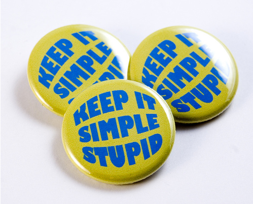
My favorite design principle…. KISS… Keep It Simple Stupid.
In all my years of being involved deeply in design in different formats & mediums, one thing emerges very clearly. The naturally talented practice KISS. The wannabe’s make things as complex as possible to hide the fact that they are not naturally talented after all. This applies to pretty much everything. Good design vs Bad design is evident in the simplicity or overloading of design elements within a design framework.
Since web design is closely related to what I manage currently, how does one keep it simple? Typically your page would consist of various elements of graphics or information that you wish to add within your design. If one proceeds logically, it is simple enough to prepare a list of what all is imperative to your page, and how you want your audience to respond to your visual and verbal messages. Usability forms one of the biggest issues to address within web design, where simplicity helps in addressing a wider audience range and ensuring that even non Internet-savvy people understand how to navigate your layouts and calls to action.
 In my experience of helping people with their design challenges, I have found that KISS as a principle forms a good premise for them to chuck the unnecessary and stick to the basics. I have had many people come to me with fancy layouts and complex element placement, fonts twisted and turned in all directions, too many patterns, overuse of color, pointless graphics, shiny blinking icons and endless design jargon. They’re basically a) hiding the fact that they don’t understand design and b) trying desperately to impress their audience with unnecessary bling.
I point out the good as well as the flab, explain KISS and ask them to come back with only stuff they think is absolutely necessary in their layout and has usability and logic attached to it. Mostly they come back with a much neater, cleaner and improved version of their original design. Most importantly, if I ask them why they used a specific color or graphic they now have a reason for doing so. Suddenly, we’re looking at defined reasoning behind their design decisions. They’re also happy to have ditched a design that was based on gut feel or instinct.
In the world of commercial usage of art, or applied art, a lot of designers forget that they are creating stuff for an audience, and they must cater to logic and usability. They’re not creating a painting or doing fine art, which a buyer would put up on his wall if it takes to his personal fancy. Within the parameters of applied art, it is a designers duty to cater to the audience and create for their usability and convenience.
Sadly, many designers in the commercial space do not even take into account an audience. This reminds me of a client who was selling chocolate (typically brown in color) and insisted he wanted a home page which was turquoise blue…shudder!! We never did manage to convince him that his page should look appetizing and mostly people do not fancy turquoise blue chocolate! I wonder what his conversions towards sales would have been if he’d ditched the turquoise and gone with the brown…
Fundamentals of design are endless, however, I wanted to start this section with KISS. Every time you start with a design project (actually in my view KISS applies to pretty much everything in life!) ask yourself if you’re practicing KISS…
Can you give a logical explanation for what you’ve designed and how you’ve placed your elements?
Is usability and logic a strong part of your design project?
Have you taken into account that your design is meant for its day to day users and not yourself?
Follow KISS and you’ll find yourself evolving to a different level of design altogether. Start with these basics and you have a good thing going. With practice, you’ll learn how to add the nuances, make the appearance of your design more refined, and add a lot of elegance into your work. The good news is you would still be following the principles of KISS but now with the foundation of your skills in place.
Beyond a point, and with stupidity out of the way, KISS will be short for “Keep It Simple & Smart”


Nice approach to design. This is where most designers falter...by trying to complicate things. Liked this post. Keep it coming.